15% off on product page · save $2.29
Soft Summer Wardrobe Guide: Muted Colors That Work
Soft Summer is a seasonal color-analysis category commonly associated with cool-leaning, muted colors and gentle contrast. It is a styling framework, not a rule about what you are allowed to wear. If a vivid color makes you happy, it can still have a place in your closet.
“Muted” describes reduced saturation: a color looks less vivid than a clear, bright version of the same hue. Dusty rose is softer than hot pink; slate blue is quieter than a brilliant blue. Muted does not necessarily mean pale. Charcoal and softened navy can bring depth to a Soft Summer outfit without the sharpness of stark black.
Color also changes with its surroundings. A smoky teal top may look greener beside blue jeans and bluer beside a green scarf. Store lighting can change your impression, too. Compare potential purchases with your existing clothes in consistent natural light before deciding whether a shade earns a place in your wardrobe. For a broader explanation of how colors relate to one another, see Adobe’s guide to color theory.
A Quick Soft Summer Color Reference
| Wardrobe role | Colors to explore | Styling idea |
|---|---|---|
| Light neutral | Soft white, cool stone | Wear near the face in tops or scarves |
| Deep neutral | Charcoal, softened navy | Try in trousers, jackets, or bags |
| Gentle accent | Dusty rose, mauve | Pair with charcoal or cool stone |
| Blue-green accent | Slate blue, smoky teal | Mix with softened navy |
Try a simple comparison at home. In indirect daylight, hold a bright color near your face, then replace it with a muted version from the same color family. Look at your face rather than the garment: does one color seem to compete for attention while the other gives you a more balanced overall look? Making the comparison without makeup or a phone filter can make the difference easier to judge.
Repeat the test with several pairs. One dusty pink might be too warm for your taste, while a cooler mauve feels just right; a particular blouse might be the wrong shape even if its color appeals to you. You are looking for a useful pattern, not a verdict from one piece of clothing.
Muted colors are not reserved for any single skin depth. Seasonal analysis considers the combined effect of a color’s temperature, softness, and contrast on the person wearing it. Your preferences matter as well. If you love a shade but not beside your face, you can try it in a bag, skirt, or shoes instead.
Featured in this guide
Muted Magic: A Style Guide to the Soft Summer Color Palette – Seasonal Color Analysis eBook for Soft Summer Wardrobe Planning | Digital Download
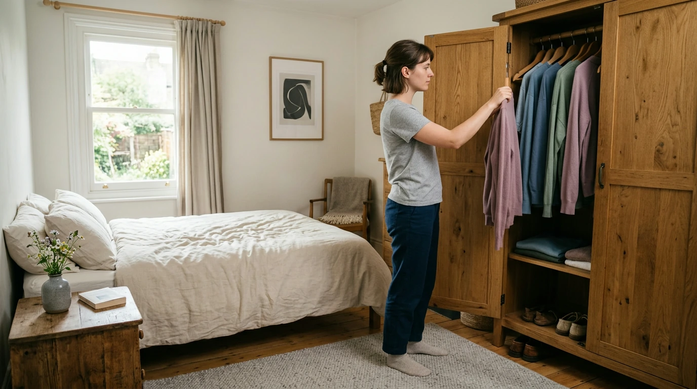
Begin with two or three neutrals you already own and wear regularly. They might be charcoal trousers, a softened navy jacket, and a cool-stone sweater. Then choose a small set of muted accents that works with at least two of those pieces. This approach gives you more outfit options without asking you to shop for an entirely new palette.
Our easy outfit formula is one neutral base, one soft accent, and an optional deeper neutral for definition. Try cool-stone trousers with a dusty-rose knit and a charcoal layer. Or pair a slate-blue shirt with softened navy pants, then add a soft-white scarf. The colors have room to vary; the point is that getting dressed feels straightforward.
Before buying an accent piece, picture at least two outfits you could make with clothes you own. Think beyond color, too. A beautiful mauve top is less useful if its fit is uncomfortable or it does not suit the occasions you dress for. We would rather help you find one piece you reach for often than several that only match a color chart.
You do not have to give up a favorite color because its brightest version falls outside a suggested palette. Look for a softer interpretation, or wear the original farther from your face. A bold pink accessory, for example, can feel easier to incorporate when the rest of your outfit uses familiar neutrals. As Encyclopaedia Britannica’s overview of color makes clear, color involves more than a name on a label; how you see a shade depends on its visual qualities and context.
This week, choose one muted neutral and one accent to try with pieces you already own. Notice how often you can wear them, whether you enjoy the combinations, and what feels missing. Let those observations—not a strict set of rules—guide your next wardrobe decision.
Compare related options such as Rock the Baggy Look: A Modern Guide to Wearing Baggy Jeans | Digital Download Fashion Style Guide on How to Wear Baggy Jeans to match features, dimensions, and use case before choosing.
Dusty rose, mauve, slate blue, smoky teal, mushroom, and softened navy are examples. “Muted” means less vivid than a bright version of the color, not necessarily light or pale.
A muted color is often described as softened, dusty, smoky, or low in saturation. Those terms describe its subdued appearance rather than a specific lightness or darkness.


Leave a comment